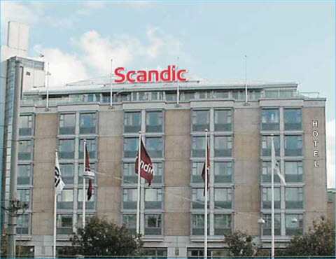
High level roof
The purpose of high-level signage is to display the brand. That is why the hotel name only becomes relevant and is displayed at a lower level (see exterior signage hotel entry /low level).
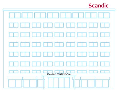
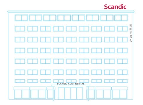
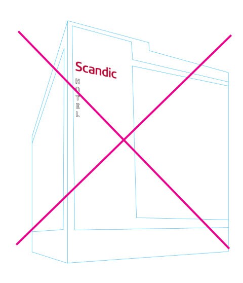
Scandic property is marked by theScandic trademark. It is made with channel lettering lighted on the inside and placed on the roof at a sufficient height to be well visible from a distance.
The pictures on this page are examples only. The actual size and placement of the trademark sign will be designed separately for each new property.
The roof sign
Text colour: Red, illuminated inside. The sides of the letters are in brushed aluminium. Red is always the preferred colour for lettering. If architectural restrictions prevent red, black or white can be used.
Material: Semi-transparent glass and brushed aluminium
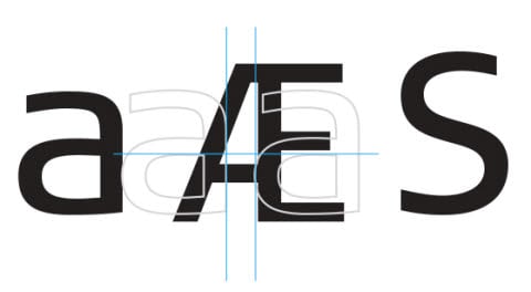
Typography: Trademark
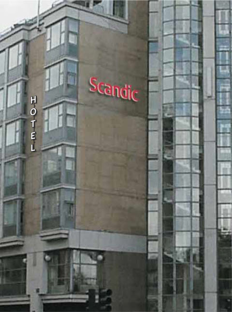
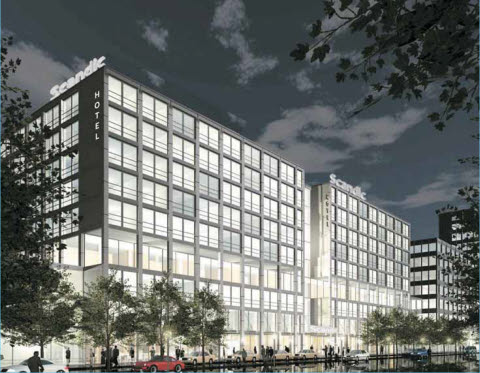
High Level Wall
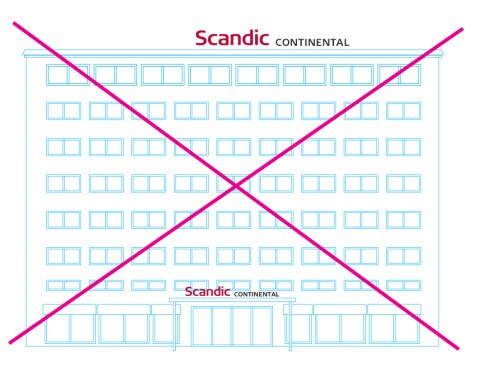
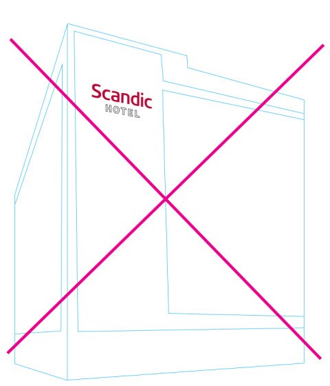
Scandic property is marked by the Scandic trademark. It is made with channel lettering lighted on the inside and placed on the wall at a sufficient height to be well visible from a distance.
The pictures on this page are examples only. The actual size and placement of the trademark sign will be designed separately for each new property.
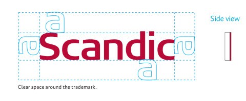
Please observe the clear space rule around the trademark. See specified technical guidelines.
The wall sign
Text colour: Red, illuminated inside. The sides of the letters are brushed aluminium.
Material: Semi-transparent glass and brushed aluminium
Typography: Corporate logo
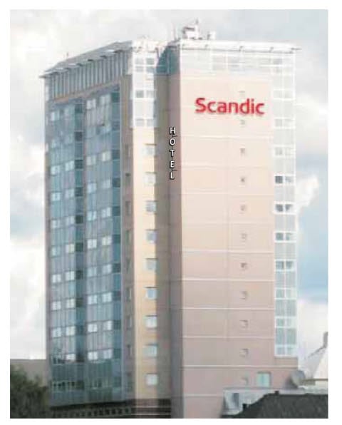
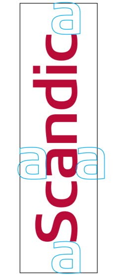
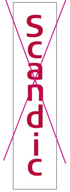
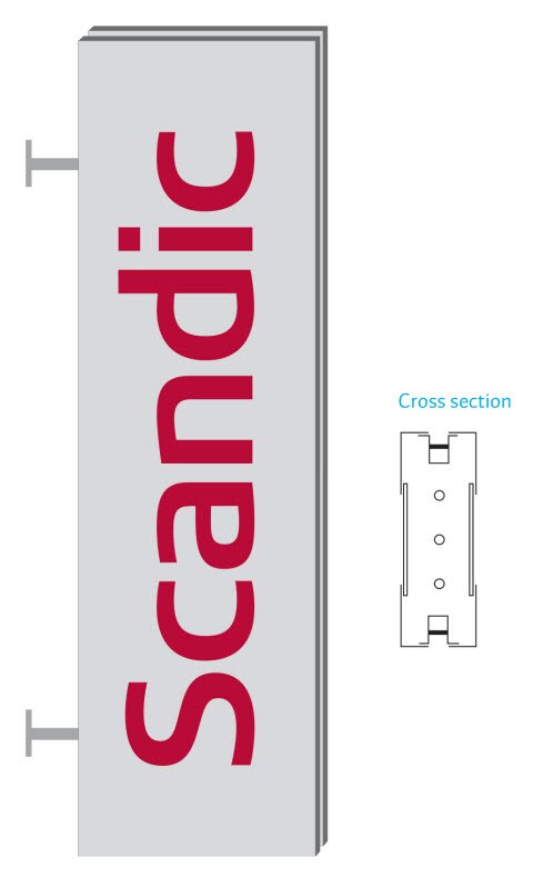
Vertical logo sign
A vertical sign is allowed in places where a horizontal sign cannot be used. The trademark is rotated 90 degrees counter-clockwise so that it reads upwards. Any other positions are not allowed. Please observe the clear space rule around the trademark.
The wall sign
- Text colour: Red, illuminated inside. The sides of the letters are brushed aluminium.
- Material: Semi-transparent glass and brushed aluminium
- Typography: Trademark

Vertical logo lightbox
This type of sign will be used in e g narrow streets where the sign cannot protrude far into the street, but the hotel must be seen from an angle when turning a street corner.
- Text colour: Perforated front plate, lettering with red glass on the inside of the box. Lit from inside the box.
- Material: Letters in red glass. Box is brushed aluminium.
- Typography: Trademark
Hotel entry / Low level
When approaching the property, the hotel name is displayed above the main entrance or another similar position. See specified technical guidelines.
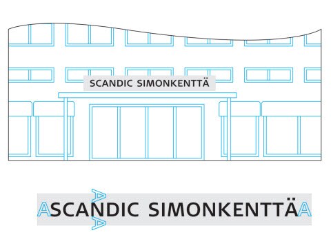
The property name sign
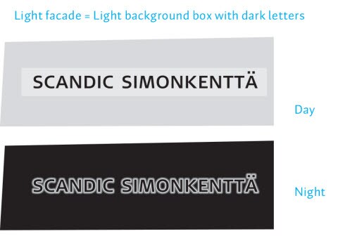
- Light façade: use light background box with black letters
- Box: Light metal with light sides
- Text: Black non-transparent channel lettering with black sides.
- The letters are raised from the backplate and backlit to create a halo around the letters in the dark.
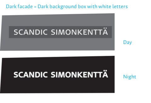
- Dark façade: use dark background box with white letters
- Box: dark metal with dark sides
- Text: Channel lettering with dark metal sides and translucent white face. The letters are raised from the backplate and illuminated inside.
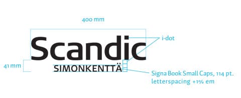
- Typography: Signa Book Small Caps,letter spacing +2% em.

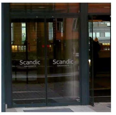
Door Emblem
The Scandic trademark appears also on the doors of the main entrance,complemented by the hotel name.
- Door emblem
- Text colour: White
- Size: width 400 mm
- Material: semi-transparent tape
- Typography: Trademark and Signa
- Book Small Caps, letterspacing +1% em.
Directional / Low level
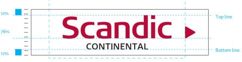
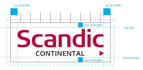
Logo in the directional sign
When the height of the installation space is limited, use these measurements to define the top and bottom lines. Scale the trademark between the lines and centre it horizontally in the resulting space. The arrow is placed outside of the protection area and centred vertically.
When the width of the installation space is limited, use these measurements to define the trademark width. Centre the trademark vertically between the top and bottom lines. The arrow is placed on the same line as the hotel name and scaled to the same height.
Directional sign, light box
- Material: Adhesive tape fastened onto lightbox.
- Typography: Trademark and Signa
- Book Small Caps, letter spacing +1% em.
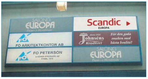
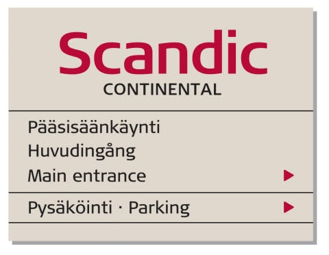
Main directional sign
The main exterior directional sign features the Scandic trademark and the hotel name. The trademark and the directional arrows are Scandic Red, the rest of the lettering is black.
- Material: Aluminium
- Trademark and text colour: Black and PMS 187 C
- Background: Brushed aluminium or painted PMS 7534 C
- Typography: Signa Column Book
- Dividing lines: Same colour as text Dots separating languages: If different languages are placed on the
- same line they should be separated by a centre dot. Its height is 20% of the capital X height of Signa Book. The dot is the same colour as the text.
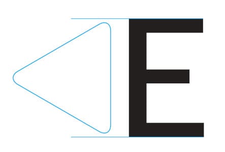
- Arrow: Scandic Red. Equilateral triangle with rounded corners (see illustration), height 94% of the capital X height of Signa Book. The distance from the sign's edge to the arrow is the same whether the arrow is on the right or on the left of the sign.
Parking sign
The parking sign displays the Scandic trademark at the upper right-hand corner and the parking symbol centred along the left edge. As the parking sign should direct our guests arriving by car easily to the hotel parking area or garage, make sure it is placed in a conspicuous spot.
- Material: Aluminium.
- Trademark and text colour: Black and PMS 187 C, white letter P on blue background PMS 300 C.
- Background: Brushed aluminium or painted PMS 7534 C
- Typography: Signa Book Small Caps, letter spacing +1% em