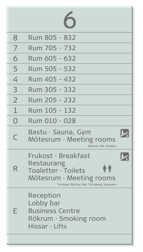
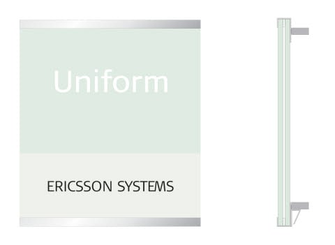
Main directional sign
Material: Glass, lacquered with NCS S 1005-G which is a green-shaded white.
Text colour: Cool Grey 11c
Typography: Trademark Scandic Red. Text Signa Book, 80 points or larger. Exceptions permissible in e g lifts and narrow passages.
NOTE: All lettering is engraved on glass.
Dividing lines: 1-1.5 mm. Same colour as text.
Dots separating the different languages: If different languages are placed on the same line, they are separated by a centre dot. Its height is 20% of the capital X height of Signa Book.The dot is the same colour as the text.
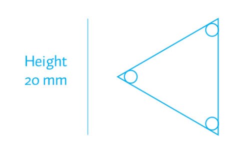
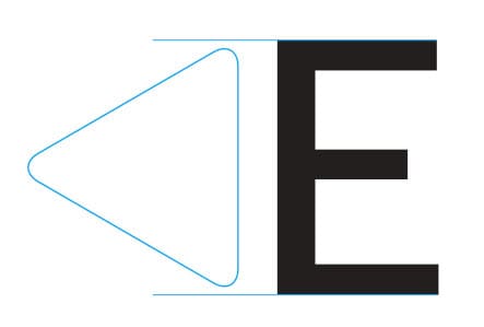
Arrow: Cool Grey 11c. Equilateral triangle with rounded corners (see illustration), height 94% of the capital X height of Signa Book.The distance from the sign’s edge to the arrow is the same on right and left.
Texts, names, logos
For signage purposes, the hotel’s public areas are called by their generic names, such as Restaurant, Bar, Lounge or Breakfast. Names of facilities, such as restaurant names, are not displayed on main directional signs unless there are several restaurants in the same building. Logos of facilities are not used in the main directional signs.
Languages
Local language comes first. Second and third languages are added if necessary. Translations of words that are similar in other languages are not necessary. (e g Restaurang/Restaurant).
Public areas
See technical information on page “Main directional sign”.
Symbols
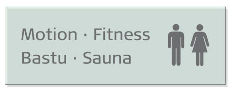
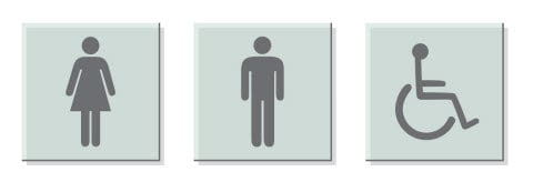
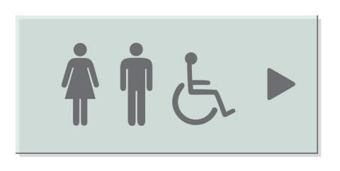
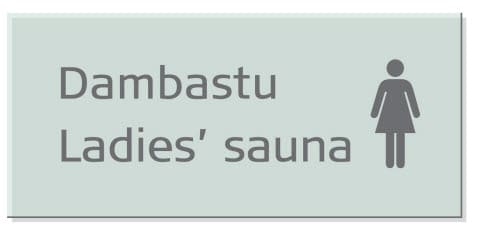
Standardised, internationally familiar symbols may be used if they simplify communication. Symbols for ladies’, gentlemen’s and disabled toilets on the doors are preferred instead of text.
See technical information on page
“Main directional sign”.
Signs
Naming
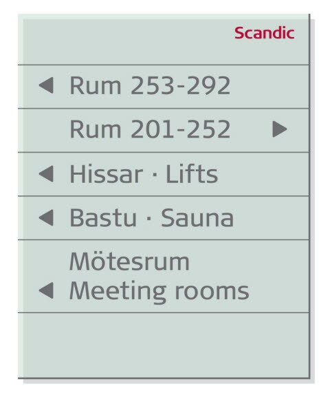
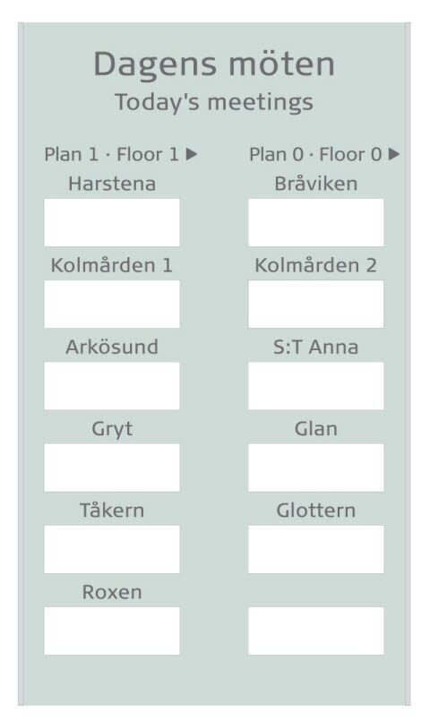
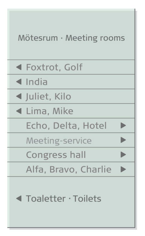
The conference facilities are referred to as Meeting rooms with local translation. E g in Swedish: Mötesrum · Meeting rooms Conference service is refered to as meeting service, with the word service determined by the local language (e g in Swedish: Meetingservice).
Directional sign in public areas
The meeting organiser’s company name is displayed in a window on the sign. The company name is printed on a sheet of paper and placed in a pocket at the back of the sign.
Size: 600 x 1145 mm
See technical information on page “Main directional sign”.
Size of sheet for the pocket: A perforated tear-off sheet where each part is 210 x 75 mm
Directional signs in corridors
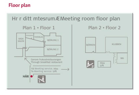
The corridors of the conference department may have directional signs. They are always entitled “Meeting rooms” or the equivalent in the local language. A floor plan may be used instead.
See technical information on page “Main directional sign”.
Directional sign in public areas / Directional sign in corridors
Signs outside meeting rooms
The meeting organiser’s company name is printed on a sheet of paper which is placed inside the sign.
Material: Glass and aluminium lacquered with Sand Brown (466 C)
Text colour: Cool Grey 11c
Typography: Signa Book 85 points
Size of sheet for the pocket: A perforated tearoff sheet where each part is 210 x 75 mm.
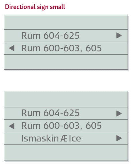
Directional sign small
Material: Glass, lacquered with NCS S 1005-G which is a green-shaded white.
Text colour: Cool Grey 11c
Typography: Signa Book upper and lower case
Dividing lines: 1–1.5 mm. Same colour as text.
Dots separating the different languages:
If different languages are placed on the same line, they are separated by a centre dot (small square). Its height is 20% of the capital X height of Signa Book. The dot is the same colour as the text.
Arrow: Cool Grey 11c. Equilateral triangle with rounded corners (see the illustration on page “Main directional Sign”), height 94% of the height of the capital X height of Signa Book. The distance from the sign’s edge to the arrow is the same on right and left.
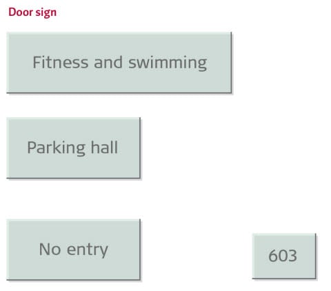
Door signs
Material: Glass, lacquered with NCS S 1005-G which is a green-shaded white.
Text colour: Cool Grey 11c
Typography: Signa Book upper and lower case
Dots separating the different languages: If different languages are placed on the same line, they are separated by a centre dot (small square). Its height is 20% of the capital X height of Signa Book. The dot is the same colour as the text.
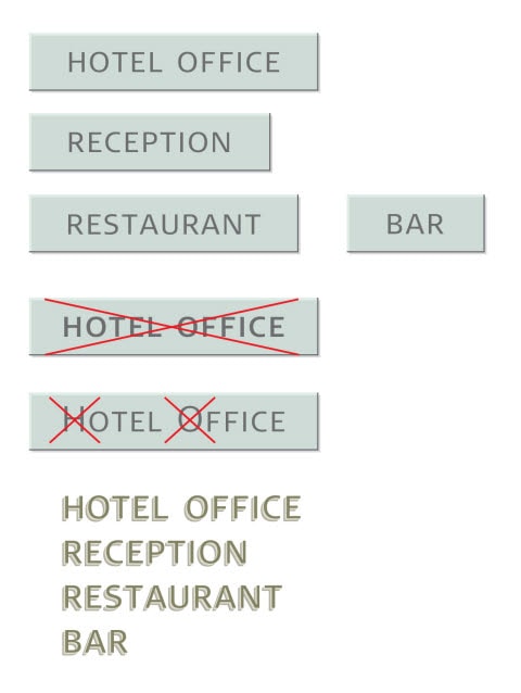
Main area signs
These signs are for larger areas inside the hotel. They should be used in places where it is not obvious for guests to see where to go. The signs are larger and may be placed above the entrance or on the wall. The text is set in small caps.
Material: Glass, lacquered with NCS S 1005-G which is a green-shaded white.
Text colour: Cool Grey 11c
Typography: Notice the different typeface!
Signa Small Caps Light, lowercase letters only.
Dots separating the different languages: If different languages are placed on the same line, they are separated by a centre dot (small square). Its height is 20% of the capital X height of Signa Book. The dot is the same colour as the text.
Loose lettering
When a backplate is not necessary, loose metal lettering may be used. Depending on the shade of the background, use light or dark metal.
Material: Aluminium, powder-coated in required colour
Typography: Notice the different typeface!
Signa Small Caps Light, lowercase letters only.