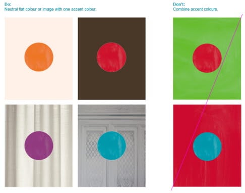
Though, keep in mind that using too many colours in one piece may lead to it feeling ”playschoolish”. As there are many handmade elements in Scandic’s toolbox there is a need to limit the amount of different colours in a design to one accent colour and one neutral background colour so as not to be perceived as childish.
Ask yourself the following questions when working with layouts with several handmade elements:
- Does this layout appeal to me as an adult?
- Will it appeal to my target audience?
- Is it communicating clearly?
- Are the key messages legible enough?
Colour in hotel or concept specific communication
Sometimes it can be tempting to define one colour to be the bearer of one concept or product, i.e. using only blue for a specific hotel. This is not recomended as the flexibility of the communication is then reduced. Scandic is limited to the use of seven colours, and these all need to be available in all contexts.
This does not mean that all colours should be used at the same time.
Please remember: If possible - always use an image of our product instead of coloured background.